Define the brand of the Fable design system and create an ecosystem of visual elements that complement and reinforce the system.
Role
Lead Designer
Fable
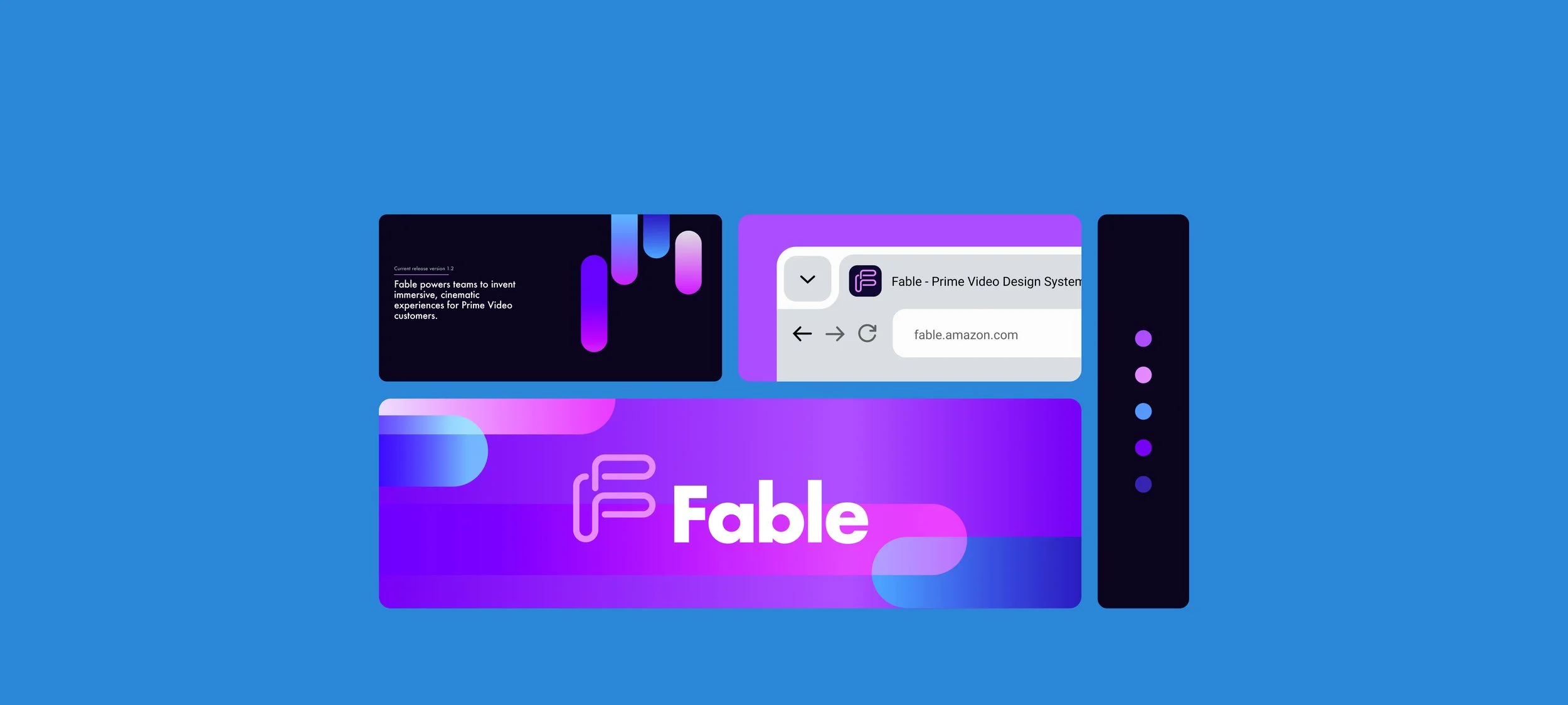
Fable is Prime Video’s design system, consisting of reusable components, working code, design resources and human interface guidelines.
Tools

Step 1
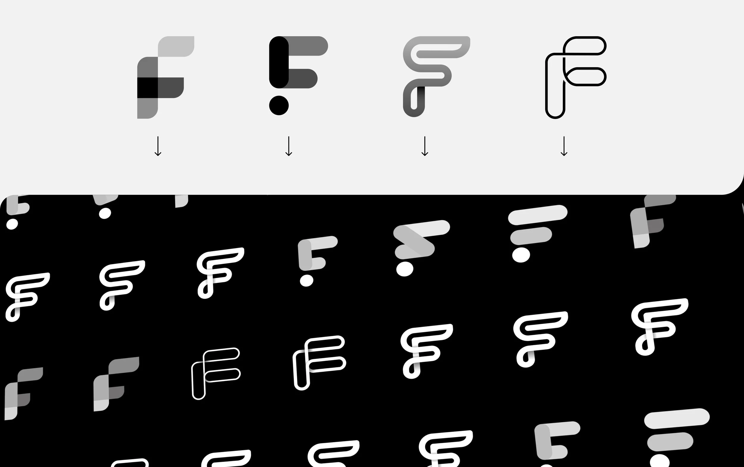
It was predetermined for Fable to be a combination style logo with the focus on “F” as an icon. This round is done in black and white to avoid swaying opinions with color. Adding the word mark comes at a later phase as its style needs to align with the icon and people can often become hung up on fonts.
I drew up around 20-30 F’s that shared some general geometric themes as inspired by the concept of a design system: Folding Lines and Paths, Divisions, and Building Blocks.
Step 2
After initial review of logo explorations the Fable team narrowed down to 4 directions and I applied feedback.
Two general directions were focused on: folding lines and overlapping paths. I explored different types of path directions, widths of the lines, and also using equivalent geometry in the shapes.
Step 3
Two options were chosen to be developed further which meant it was time to explore color. I had this idea for a RGB rainbow creating a variety of shades through their overlapping shapes. I wanted to go with that distinct neon that only a screen can give. When asked for specific color direction, the Fable team asked for pink or purple so I wanted to try a variety of options.
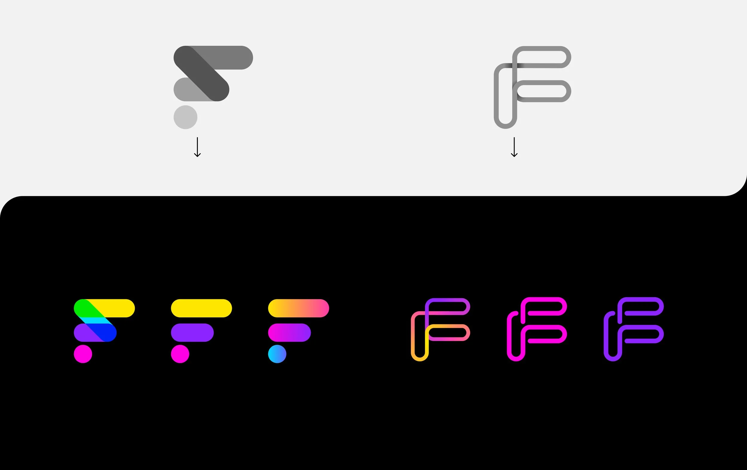
Step 4
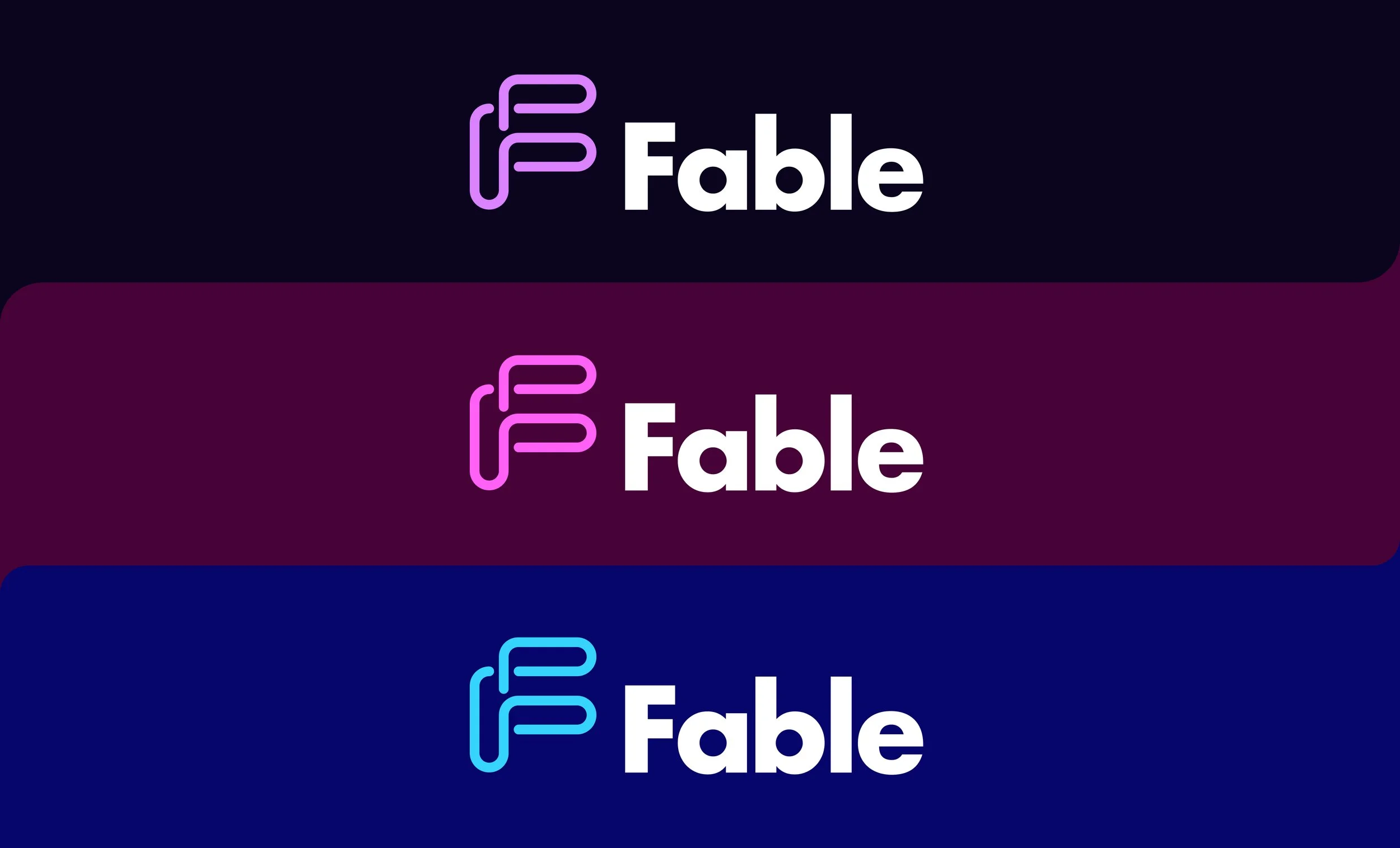
The final icon was chosen and the team was very set on “Futura” being the font. The team liked the solid color options and wanted to continue looking at pink and purple and a third color, blue. I tried 3 different color palettes that each had a variety of primary and accent color options.
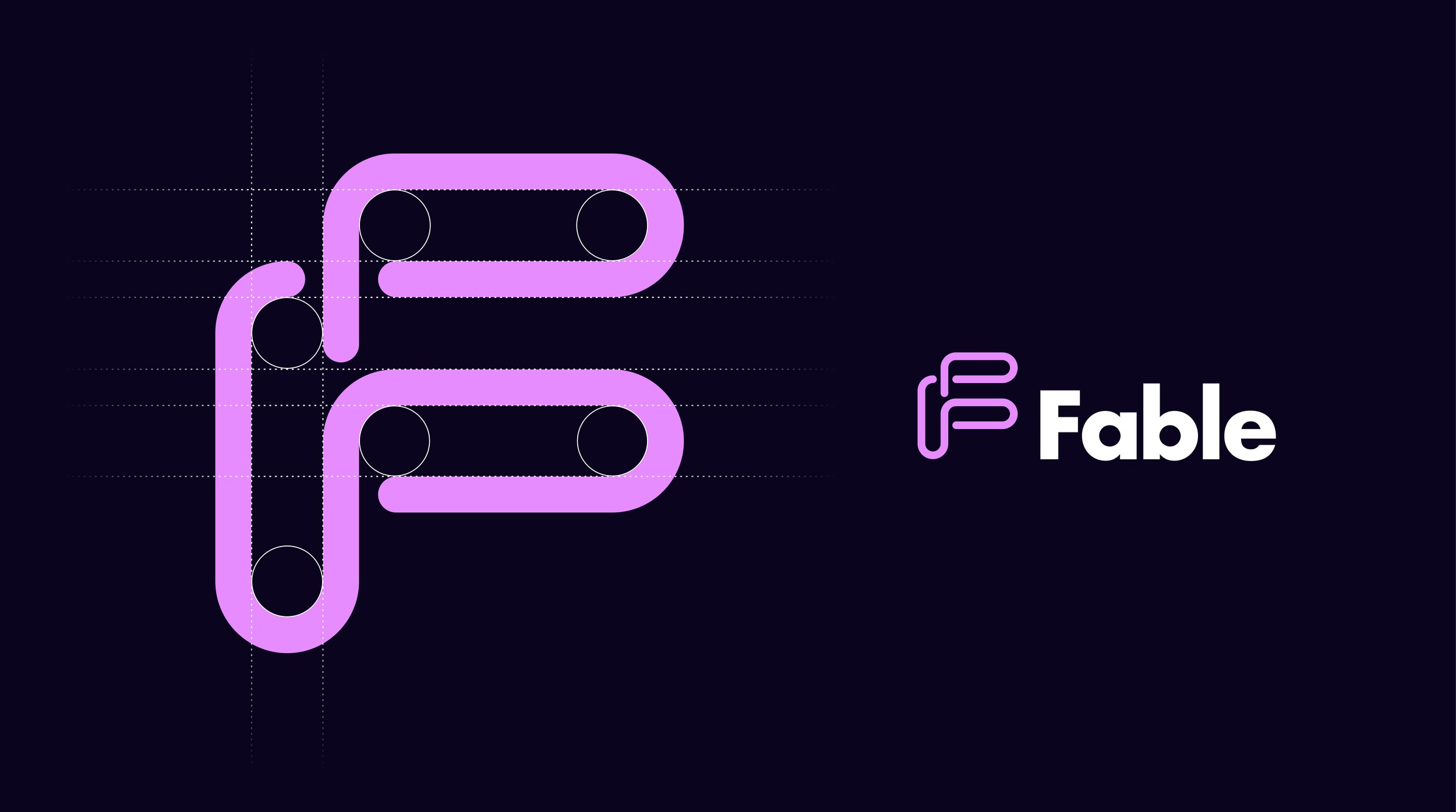
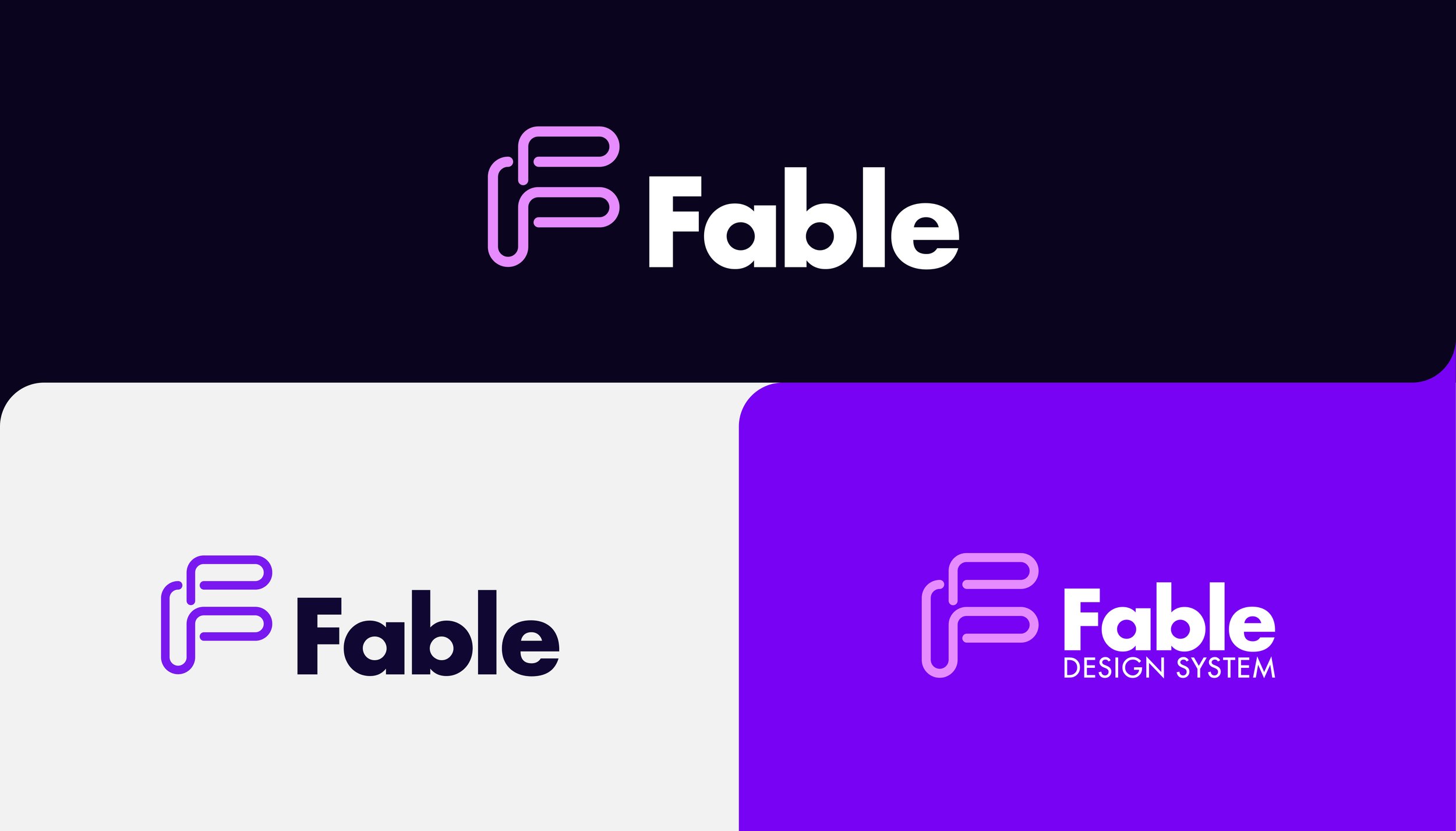
Final Logo
Once the final logo was set a variety of options were made for all the possible use cases. I created a guide that outlined these use cases along with the color palette and typography.
Color Palette
I didn’t want to go with just black as the dark option so looked at a very rich purple. The design system website that would serve as a reference point for engineers and designers was going to be in dark mode so this dark purple became a primary color. For accents I wanted to compliment the purple and lilac with cooler tones.


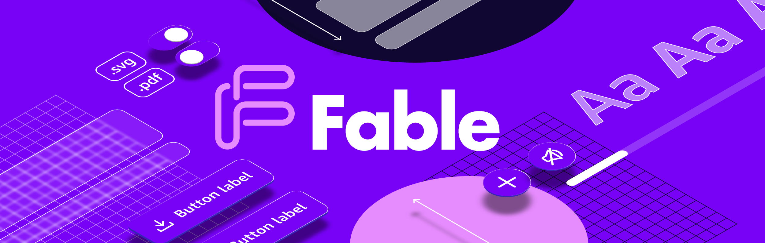
Artwork Concepts
The branding for this needed to be super simple as it was only going to be used on a handful of things. I did 4 concepts: 2 that used elements from a design system as inspiration for the art and 2 that utilized simple shapes and geometry.


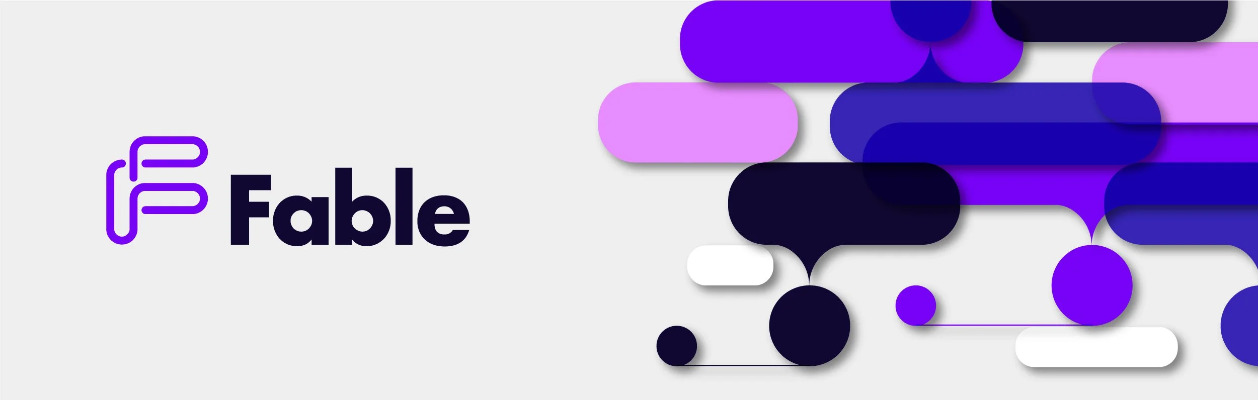
Final
I used the artwork to create finalized guidelines along with assets for presentations, figma boards, and print materials. The look was applied to the Fable design system website that would serve as the main point of reference for engineers and designers. Additionally I designed merchandise for the design system kick off.
