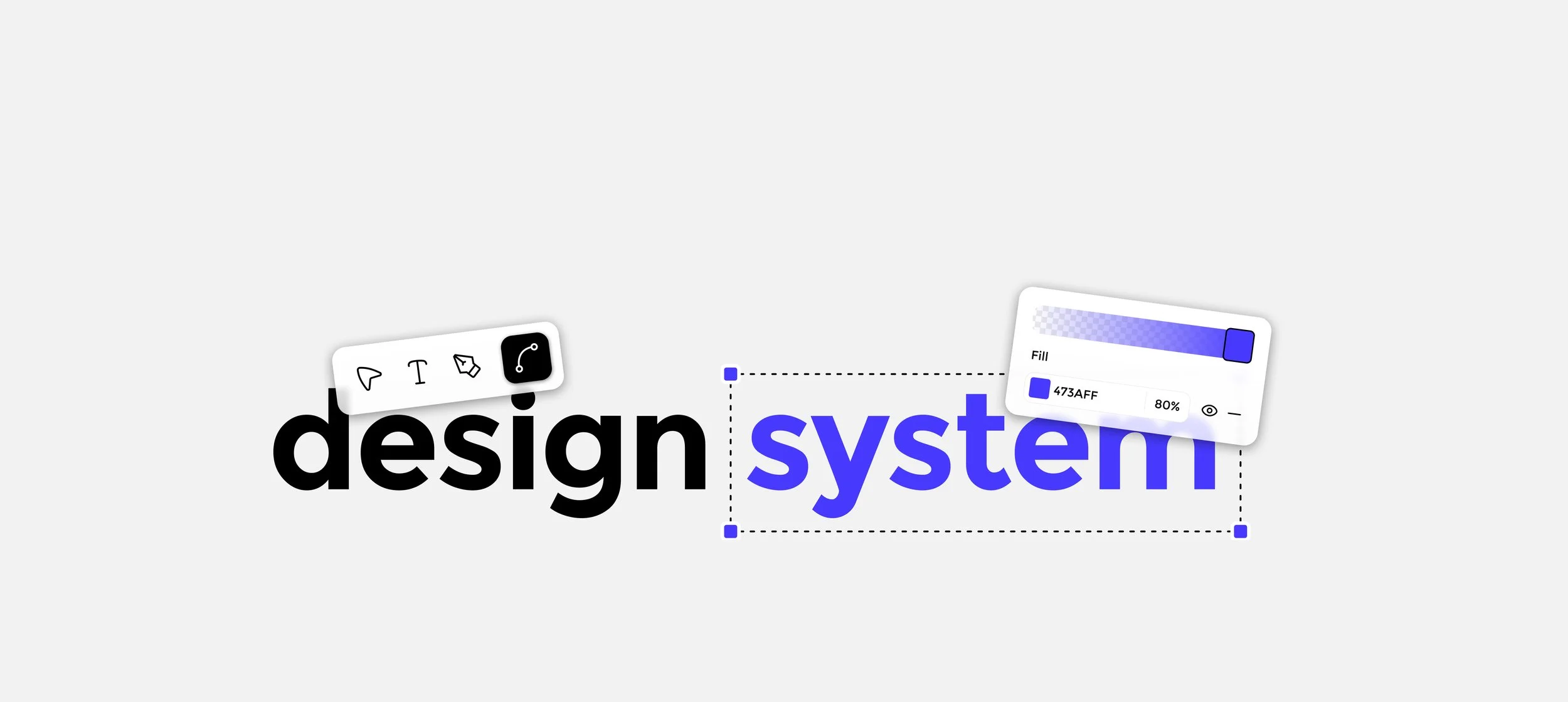
The Design System
Design systems ensure clarity and consistency, enabling seamless user experiences through reusable components while boosting efficiency, collaboration, and user trust. Kular lacked a design system, resulting in an inconsistent and fragmented UI.
Before beginning the redesign, I established a comprehensive design system by breaking down the interface into foundational design tokens—including typography, color palettes, spacing, and interaction patterns. I then built a scalable component library that served as the foundation for redesigning the entire Kular web app, ensuring consistency across all features and streamlining future development.

Typography
Color Palette
Icons
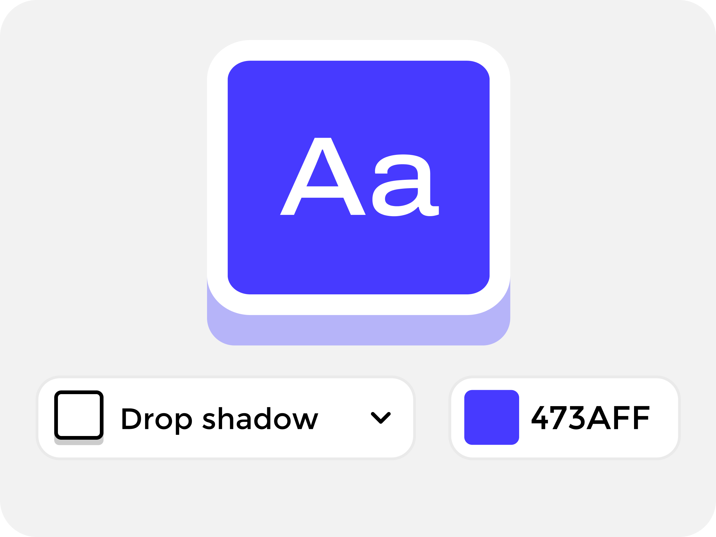
Effects
Spacing and Radius
Buttons


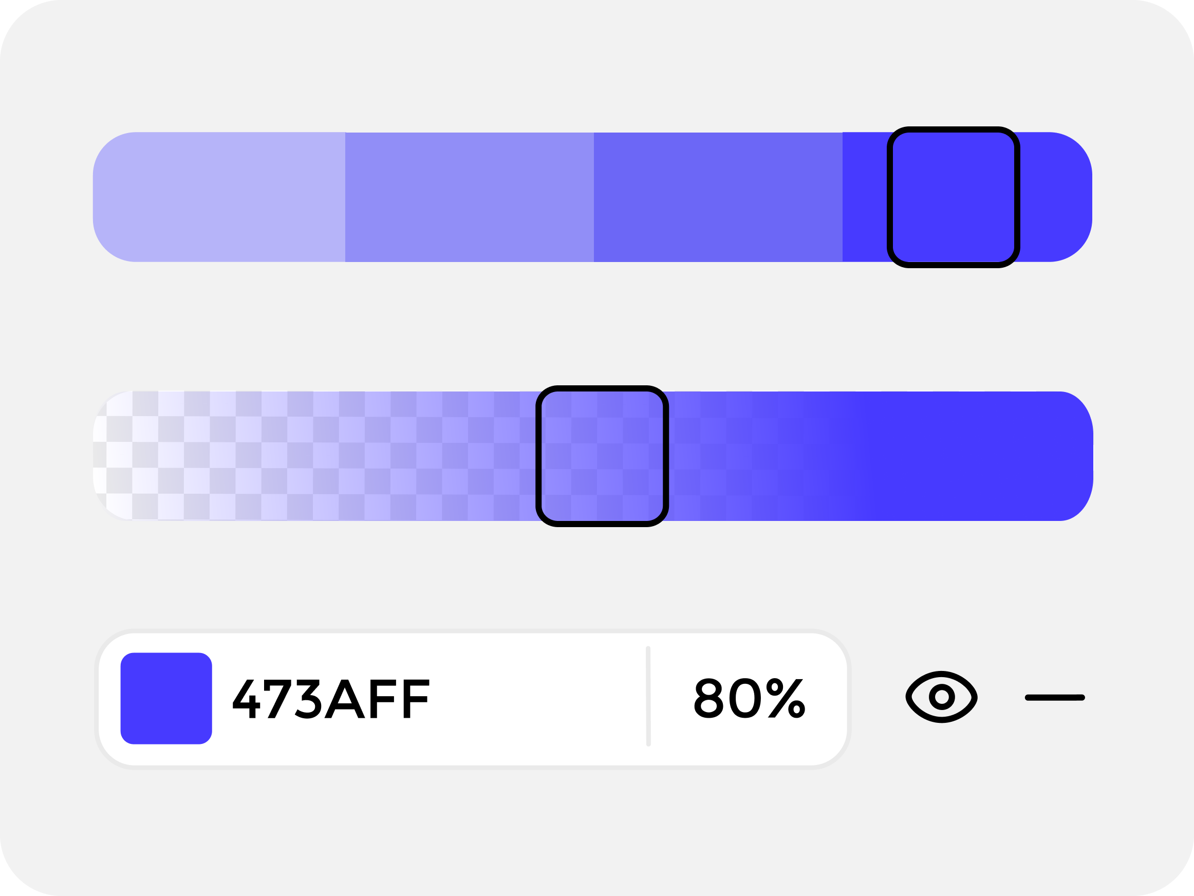
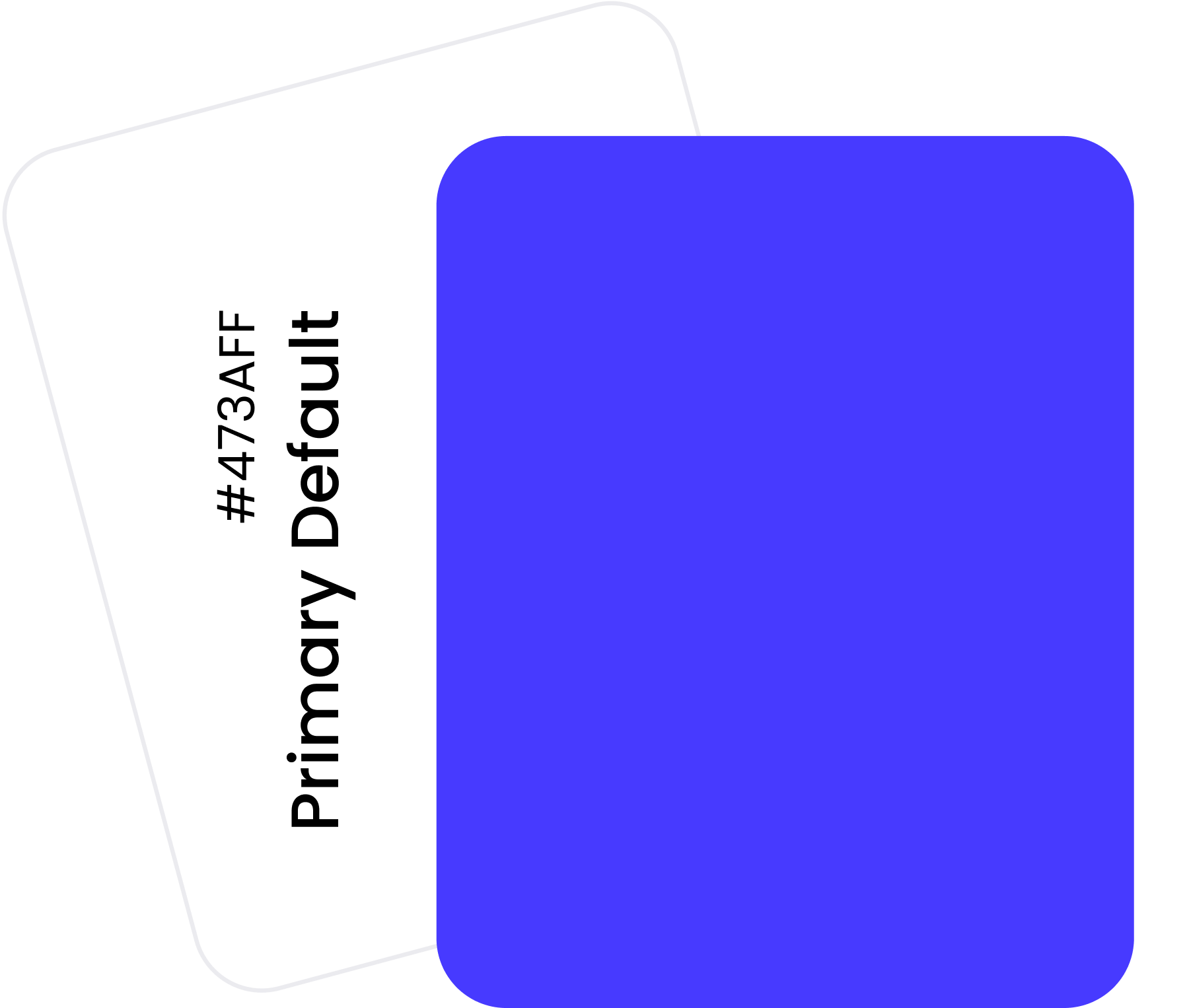
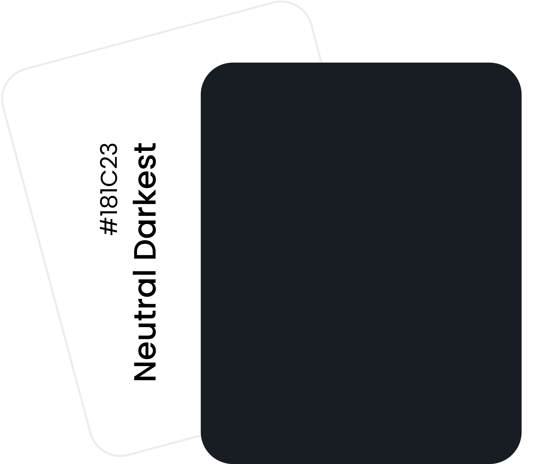
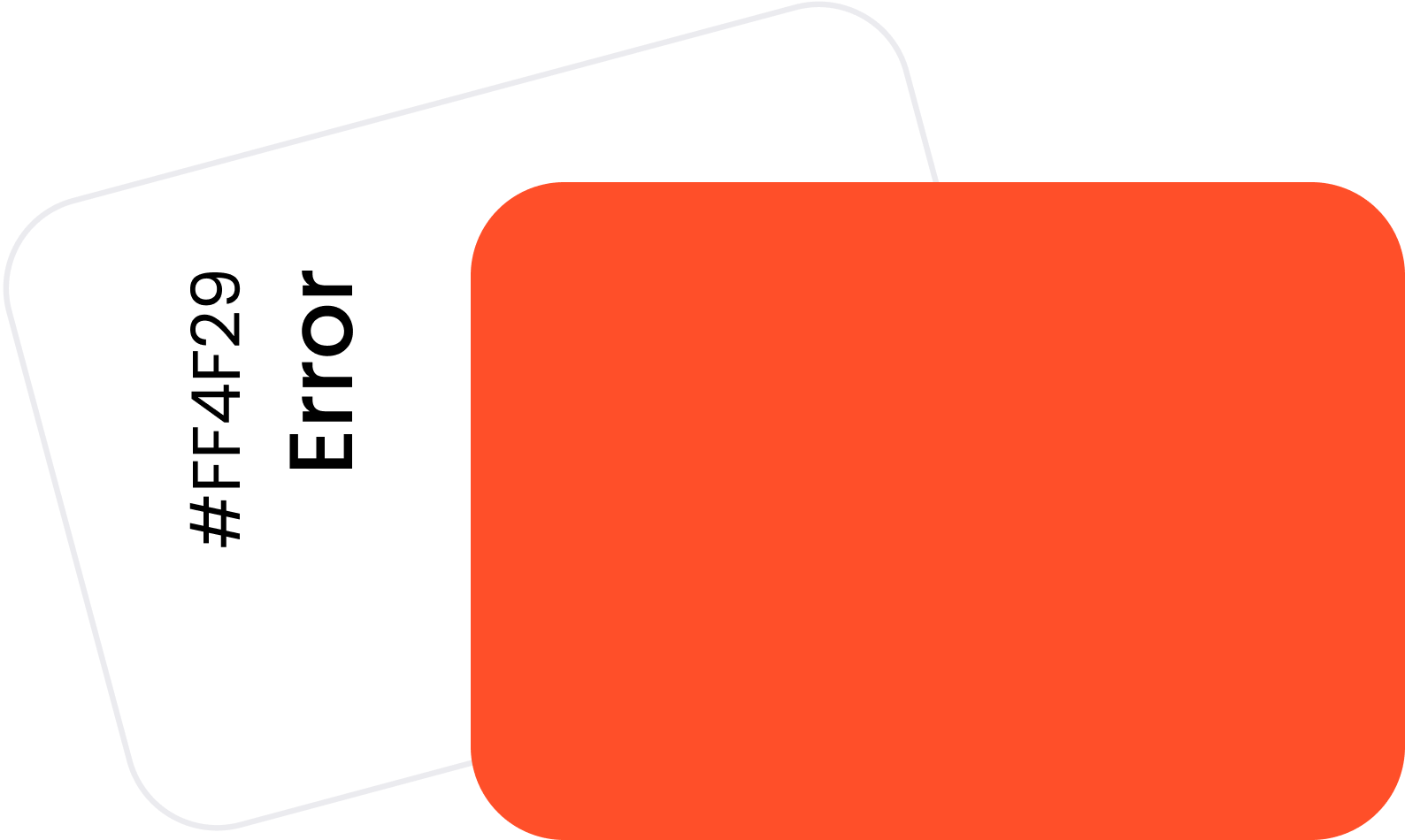
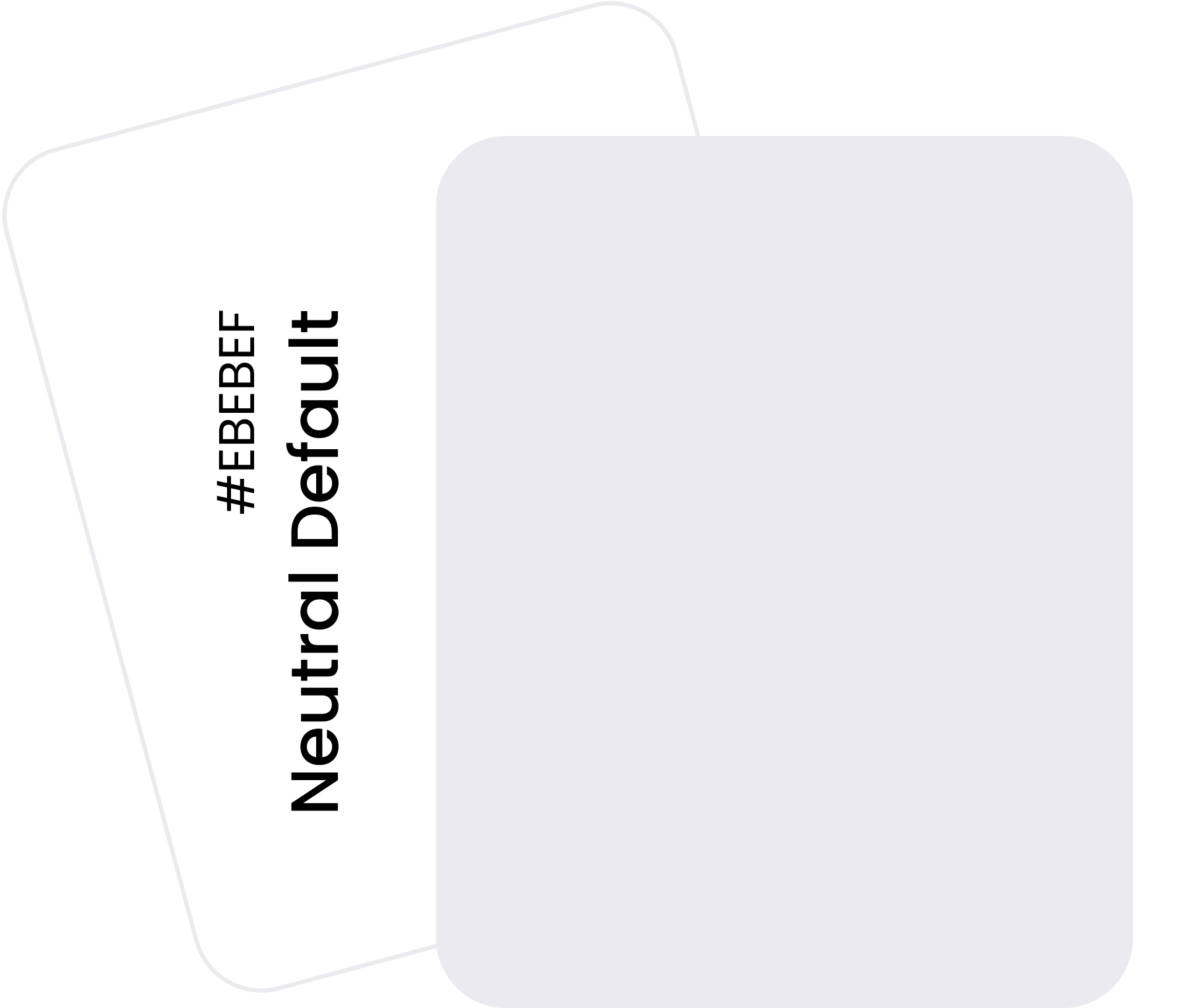
Color Palette
The default brand color was established prior to the development of the design system. Using this as a foundation, a color spectrum was created ranging from #100 to #900. Additionally, a secondary neutral color palette was developed. Alert colors for warnings, errors, and success states were also defined across their respective spectra.


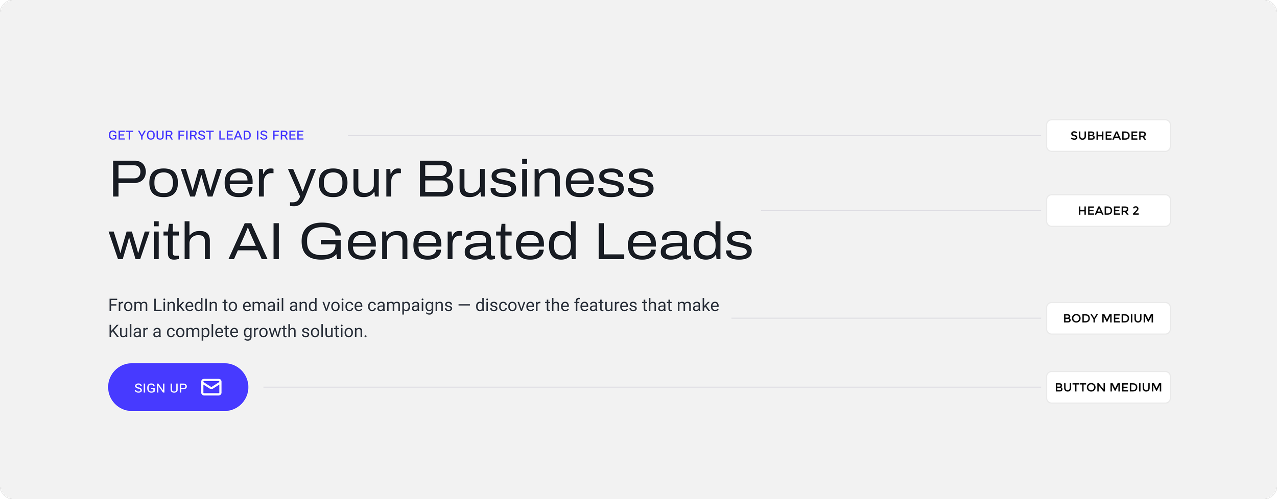
Typography


Kular's original typeface lacked legibility and was visually overpowering, creating distraction rather than clarity. I selected two new fonts that prioritized readability, perfect for data-heavy dashboards, while maintaining a sleek, modern aesthetic with distinctive character. I then established a comprehensive typographic hierarchy within the design system, defining styles for H1-H6, subheaders, body text, captions, and button labels to ensure consistency and scalability across all interfaces.
Icons
In the old project, Kular used three different icon styles. Icons are one of the easiest ways to establish visual harmony by applying consistent stylistic rules, such as a 2px stroke and a 24x24 grid for icon sizing.
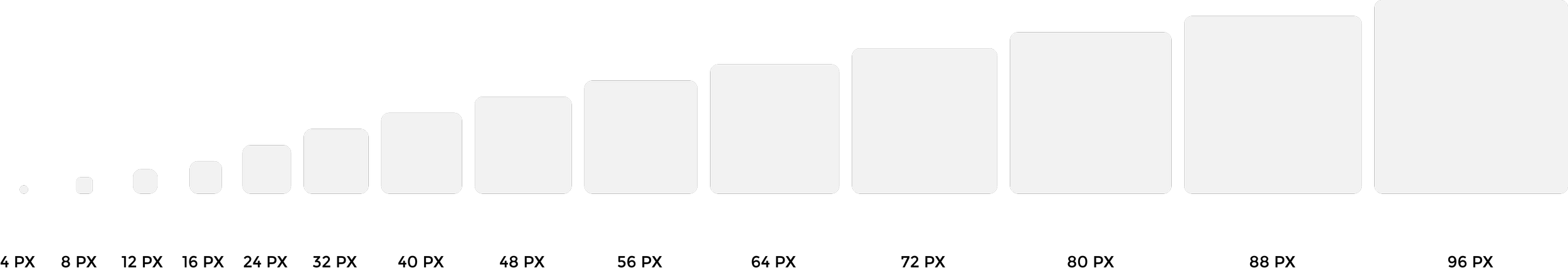
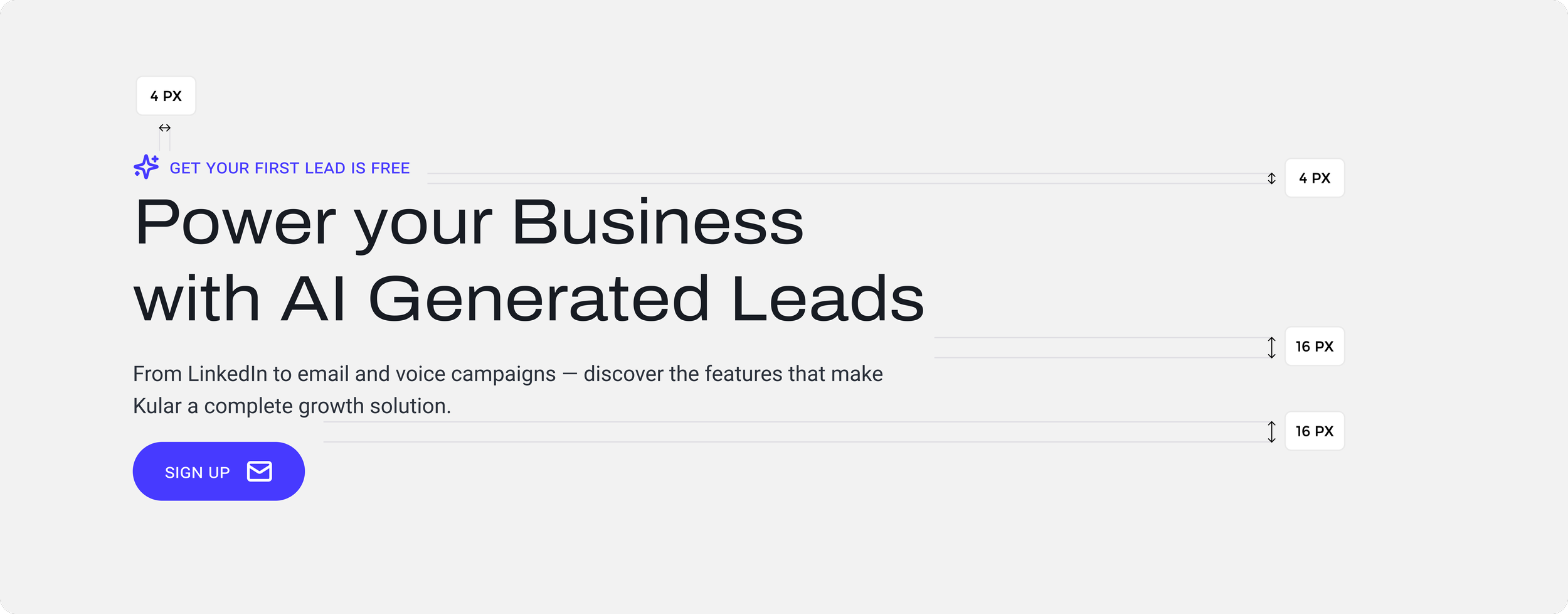
Spacing and Radii
My preferred spacing method is an 8px linear scale for elements and 4px for spacing icons, small text blocks and elements.
The corner radius can be subtle or more significant. Full radius was applied to buttons for a pill shape while most card components used the 24px and 36px.


Effects
Consistent use of shadow helps users identify components and ensure visual harmony.

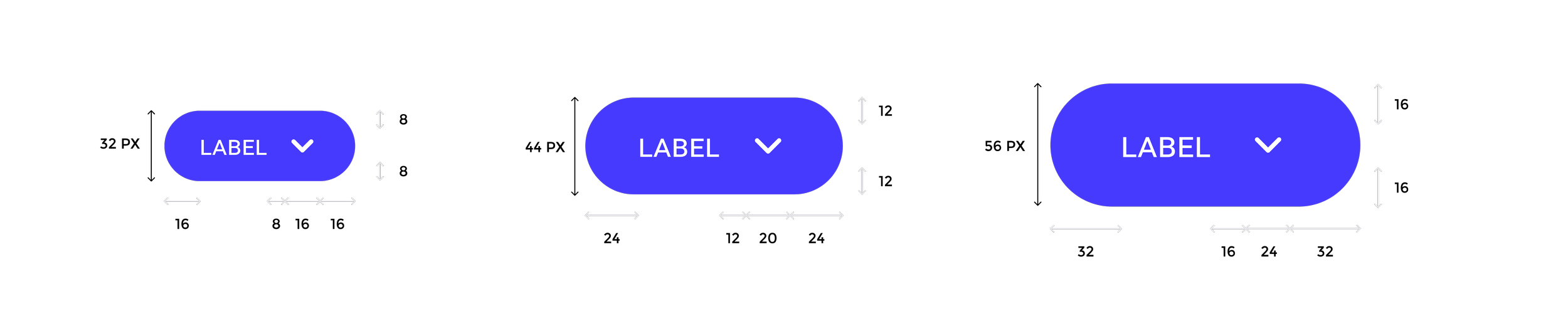
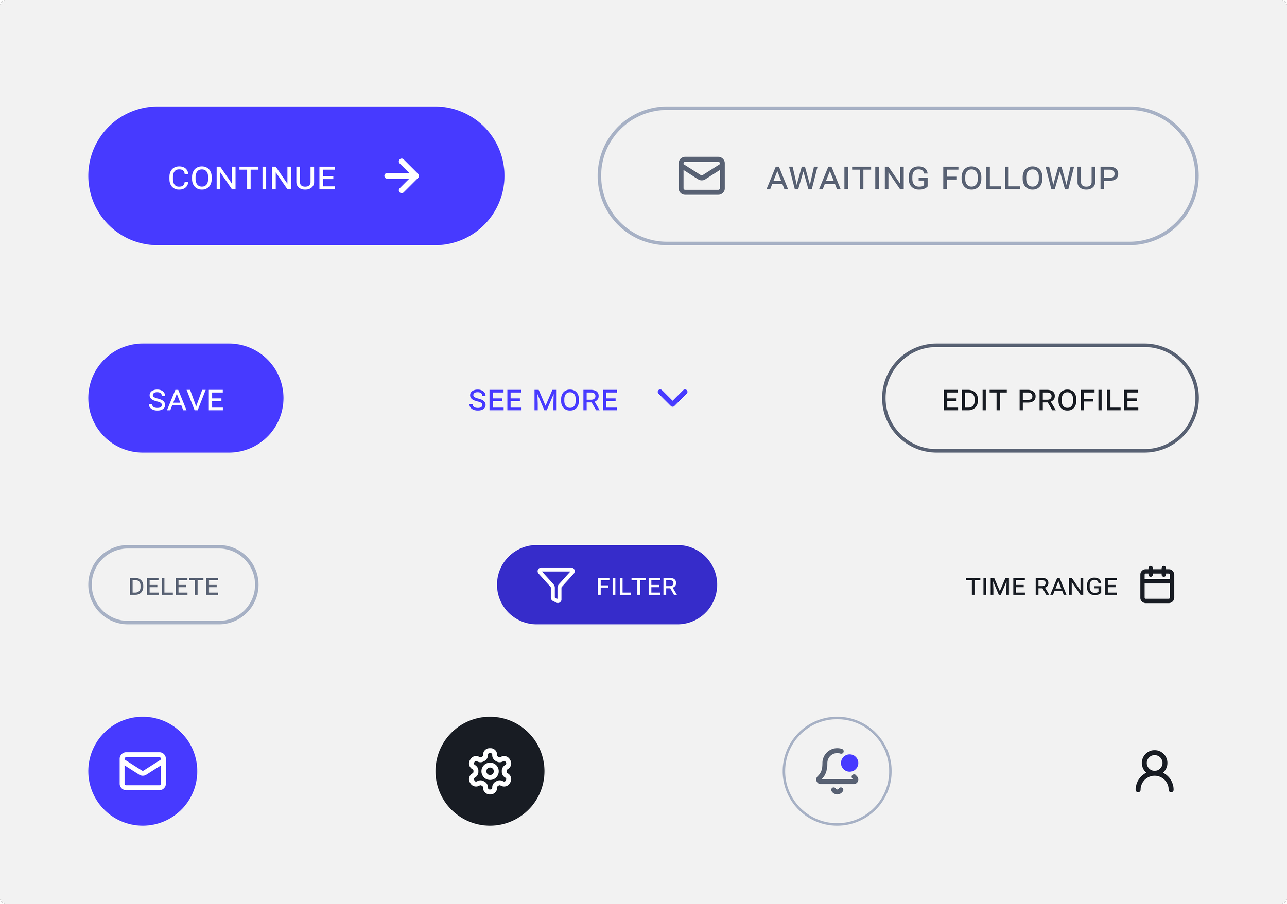
Buttons
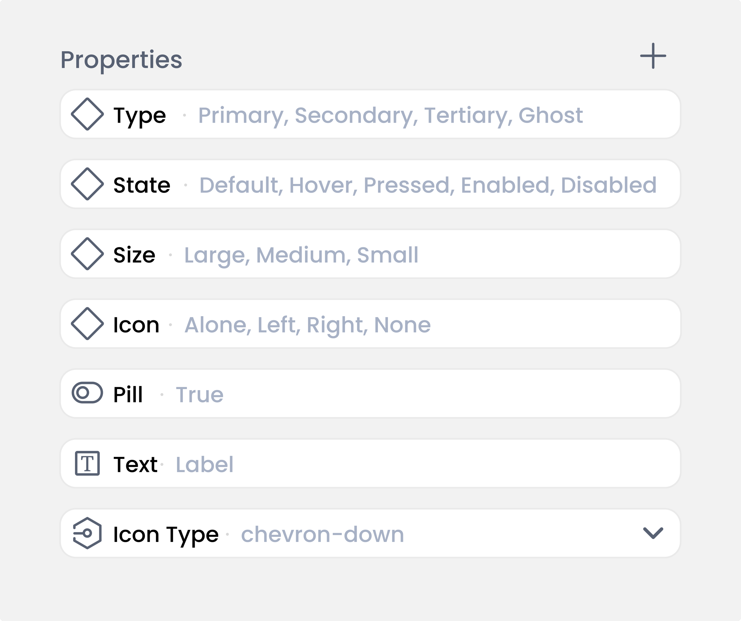
Kular featured a variety of button shapes and styles, including square, outlined, pill-shaped, two-tone, and some with drop shadows on hover, as well as outline and color shifts. Buttons are essential for attracting users and guiding their interactions. They also help establish hierarchy, create visual patterns, and enhance the overall user experience. I designed four button styles: primary, secondary, tertiary, and ghost. These styles were available in three sizes, with various icon placements and interactive states.
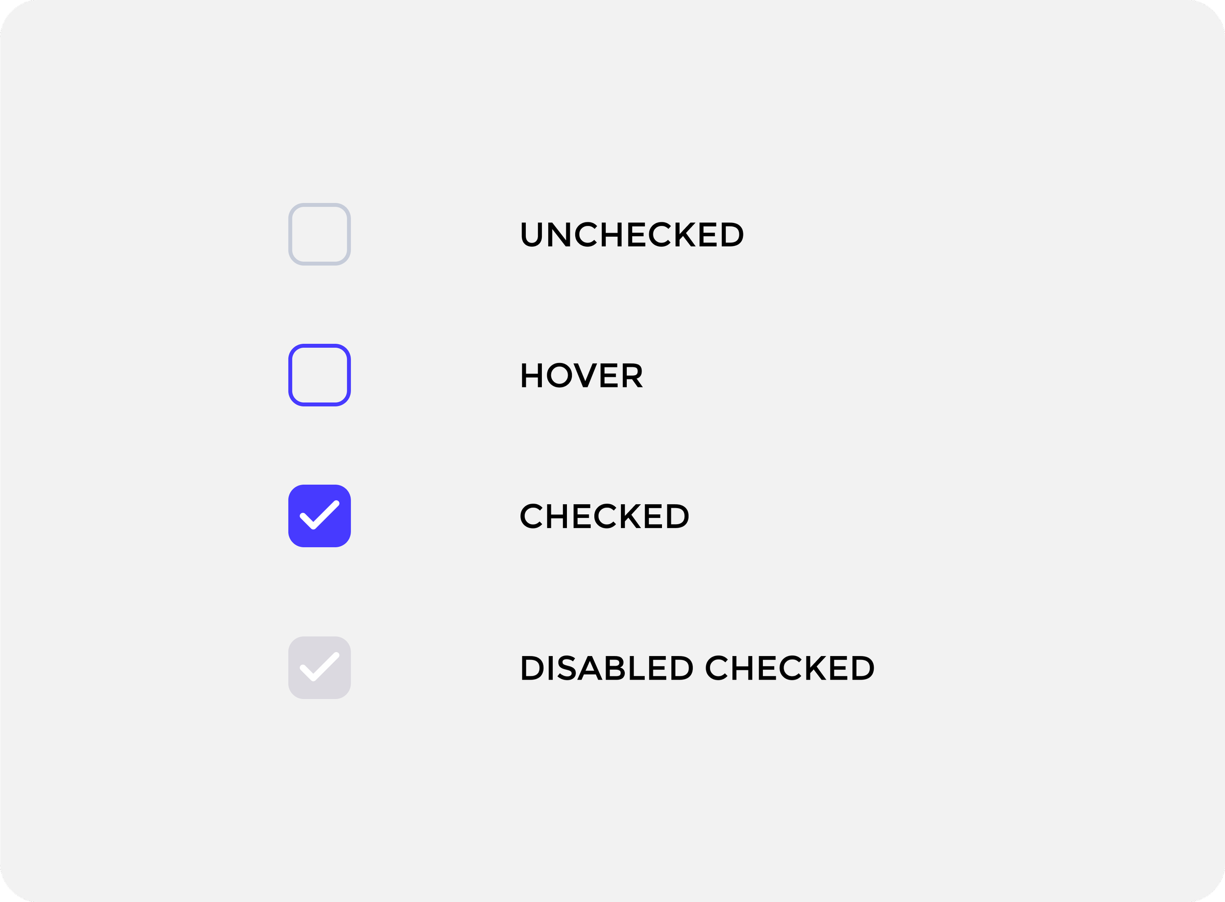
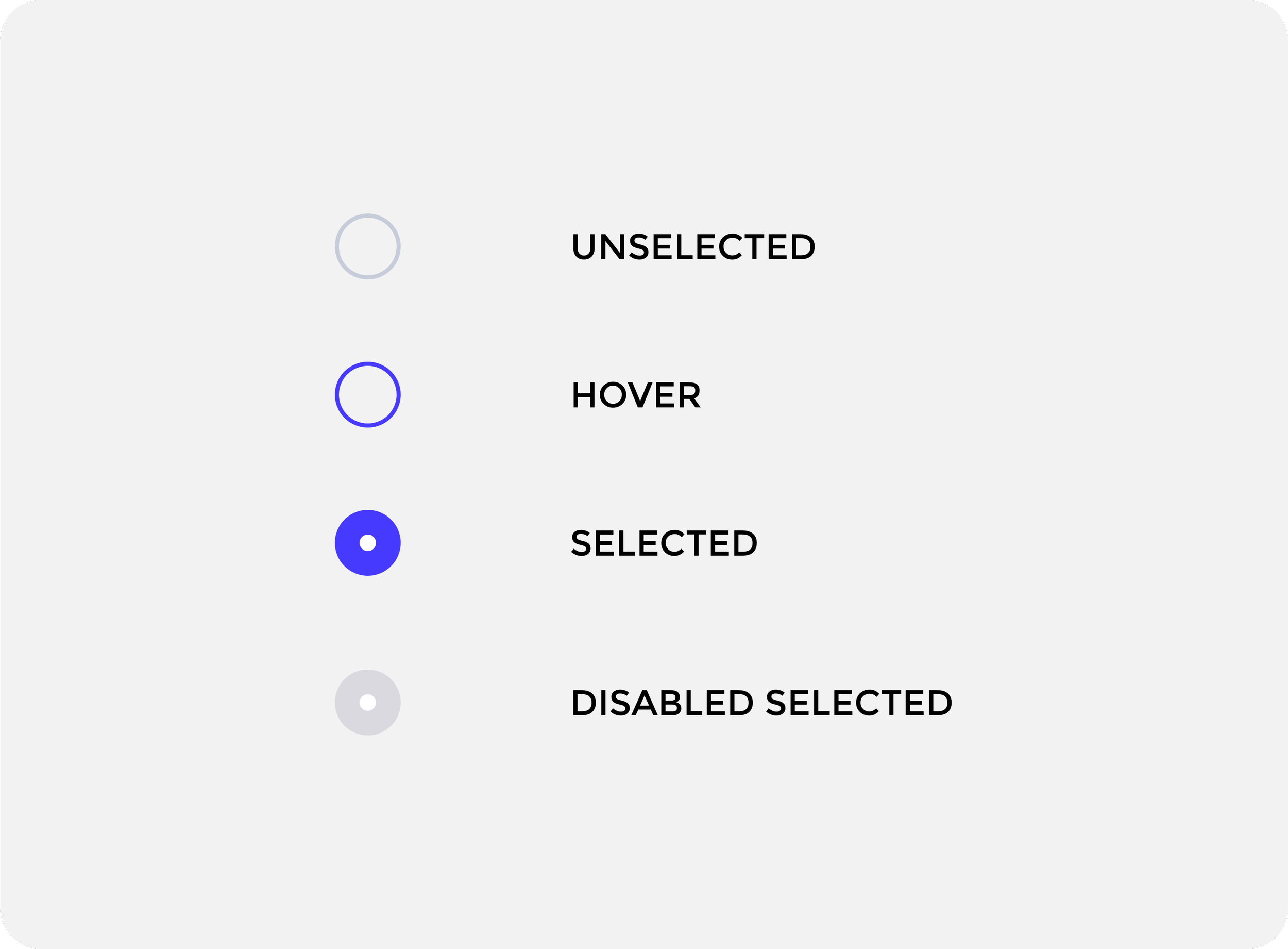
Toggles, Radio and Checkboxes
Checkboxes, Radio buttons and Toggles are essential UI elements that allow users to control all kinds of options, settings and situations. Checkboxes allow for multiple sections, while radio buttons are for single choices. They all display options compactly, enhancing user experience.