Translate the brand identity, to ensure consistency, accessibility and a high quality bar for the artwork, marketing and user experience.
Problem Statement
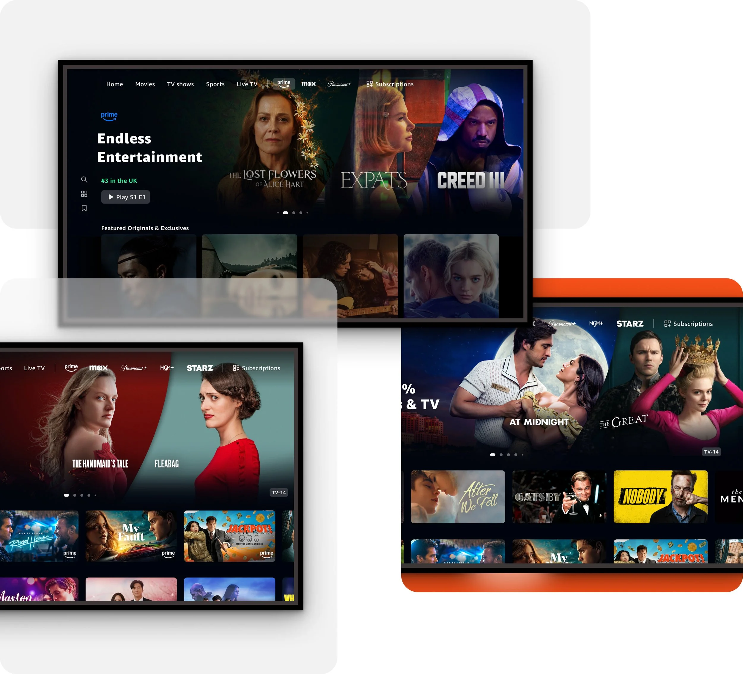
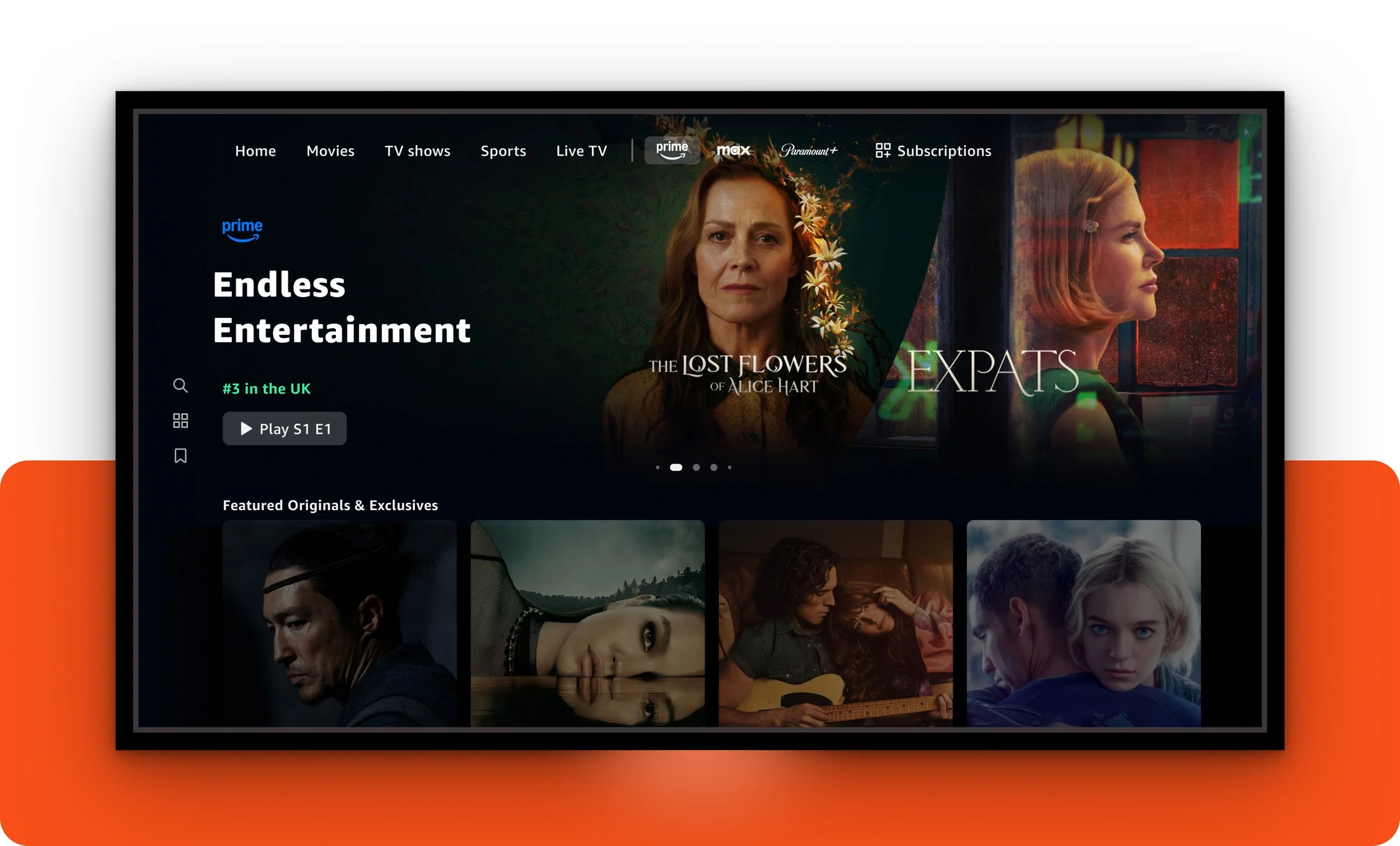
When I joined Prime Video as Lead Visual Designer, engineering, product, UX, brand, and creative marketing teams operated in complete silos across time zones with no cohesive visual strategy, resulting in artwork that was inconsistent, failed accessibility standards, and frequently broke when teams made uncoordinated changes. My role was to unite these disconnected organizations while prioritizing user needs. I facilitated a cross-functional workshop with all stakeholders and created a strategic roadmap that established comprehensive visual guidelines for Prime Video's entire catalogue, standards for internal and partner marketing, and introduced new machine learning-powered personalized carousels that targeted content to individual users.
ROLE
Lead Visual Designer
SCOPE
Platform-wide cross collaboration with engineering, product, creative marketing and brand
TOOLS

Old Designs

Pride Seasonal Promotion
Prime Member Promotion

Spring Seasonal Promotion
Deliverables
Cross-Promotional Hero Images
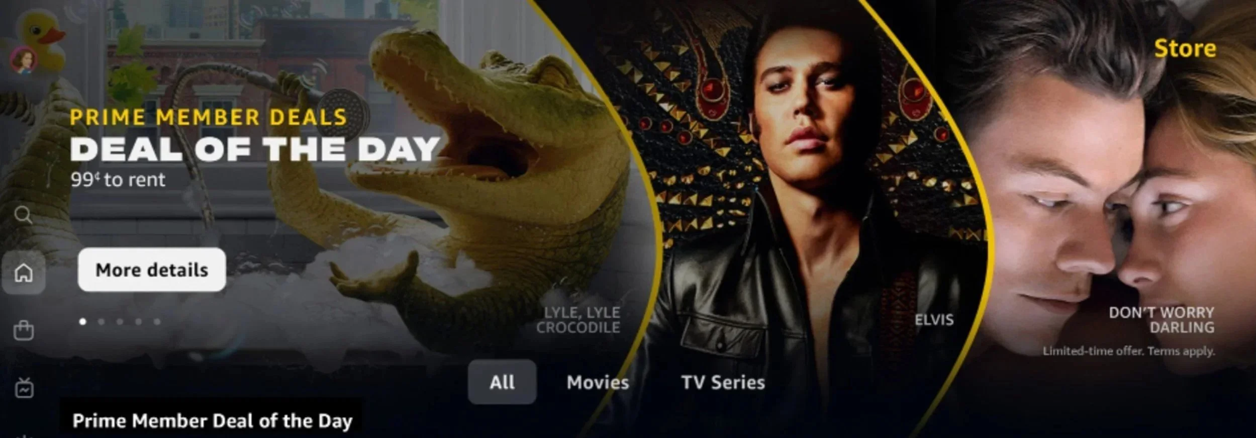
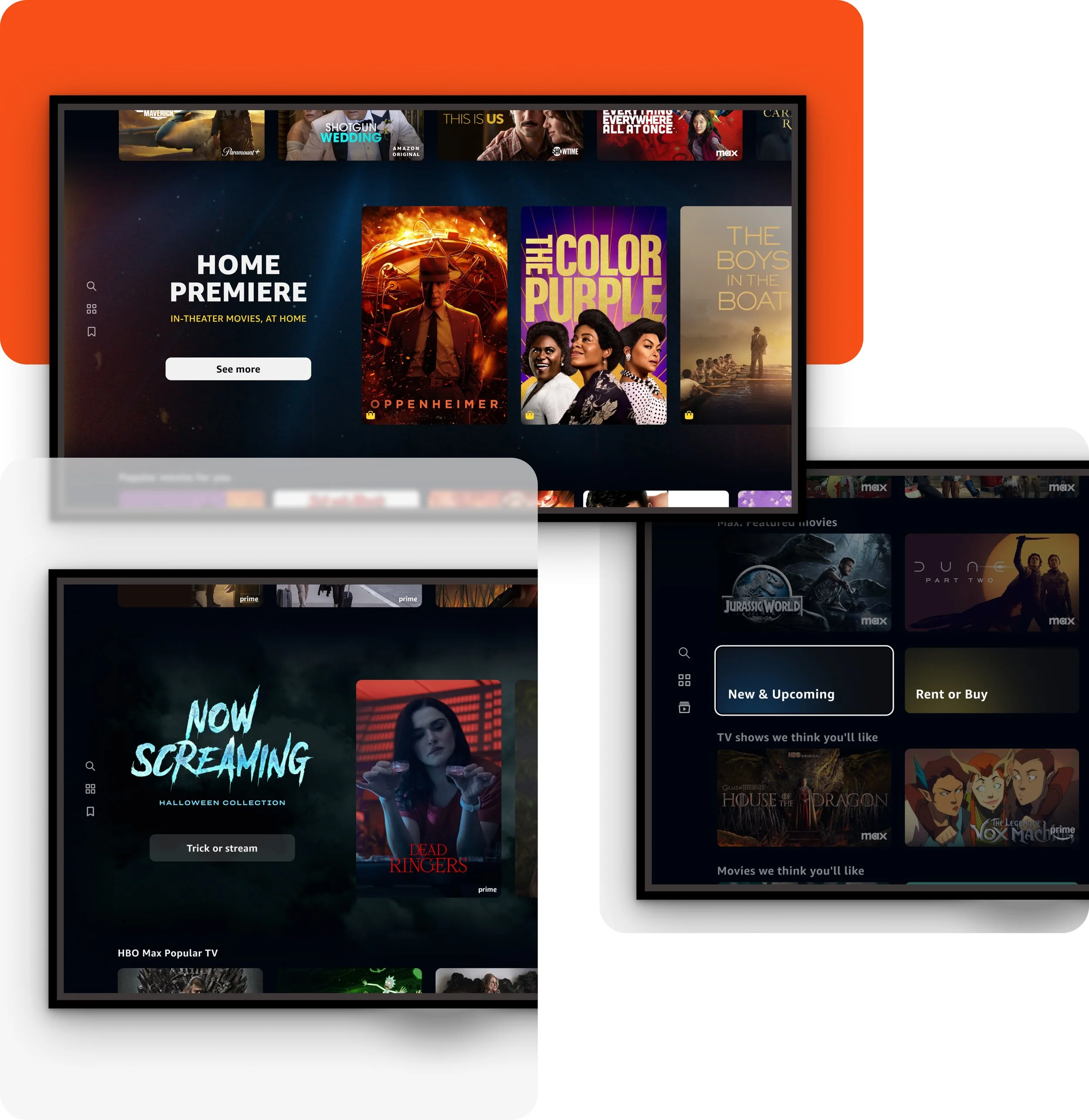
Designed comprehensive guidelines and templates for hero images featuring multiple titles simultaneously. Previously, artwork was being obscured by UX elements, logos were illegible, compositions were cluttered with too many characters, and there was no consistency across promotional materials. I created standards that defined safe zones, hierarchy rules, and character limits while providing creative marketing with flexible templates that worked within UX parameters—ensuring promotional impact without compromising usability.
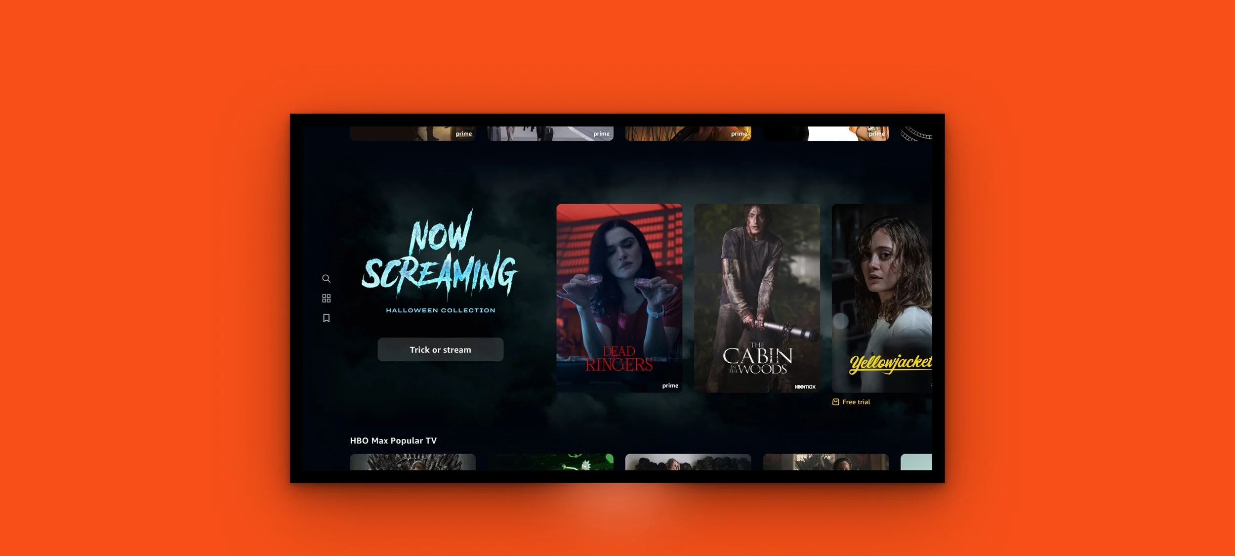
Mid-Hero Themed Carousel
Introduced a new mid-hero carousel format enabling seasonal, holiday, and machine learning-targeted thematic promotions. Previously, themed content competed with individual titles in the hero space, limiting promotional flexibility. This new format featured specialized background artwork, custom title treatments, and motion design applications that created immersive, personalized experiences while maintaining clear content hierarchy and accessibility standards.
Machine Learning-Powered Short Carousel
Designed a new short carousel format leveraging machine learning to deliver personalized deals and genre recommendations tailored to individual user preferences. This compact, data-driven format increased content discoverability and engagement by surfacing contextually relevant offers at the right moments in the user journey, creating a more personalized Prime Video experience.
Final Results
User Impact: Consistent visual language enabled faster content recognition, increased engagement and time on platform, and improved retention through more satisfying experiences. User complaints about obscured content dropped by 80%.
Business Impact: User engagement with personalized content increased by 31% for in-app partners, driving measurable improvements in conversions and subscriptions through intuitive, visually appealing designs.
Operational Efficiency: Cross-functional design systems reduced creative marketing’s time of custom burnt-in work by 70% and coordination time by 60%, enabling UX to design confidently, giving brand teams creative flexibility within guardrails, and accelerating feature development.
Accessibility & Compliance: Improved accessibility compliance from 40% to 95%+, meeting WCAG AA standards.
Strategic Transformation: Shifted Prime Video from fragmented, siloed visual experiences to a cohesive, scalable design system that positioned the platform competitively in the streaming market.